

Review | Redesigning the New York Times app — a UX case study.


Review of UX design thinking process and implementation
This article examines a case study that focuses on remodeling the New York Times apps. Hence, this is a review of the UX design thinking process and implementation. It analyzes three major features that I, as a beginner in UI/UX design, found striking. I love how they use these features to present a humanizing and user-centric product.
I greatly enjoy and appreciate the designer's originality and authenticity. The design case study was written in a simple yet creative manner.
Now, let's explore the three aspects that stood out the most to me:
Design Project Description: Problems, goals, and objectives

The New York Times app was facing challenges in retaining users due to various factors such as
coverage dissatisfaction,
life-changing events,
lack of usage, and irrelevant content.
This highlights the importance of continuously improving the user experience to maintain user loyalty.
Furthermore, the proposal to add a feature that is "Timely" was not forced on users. As preparation, research was done to provide users with notifications at opportune moments throughout their busy day. Thus, this demonstrates the value of understanding user habits and integrating the app seamlessly into daily routines.
User Research Overview: Methodology and Conducted Research Details
The design process involved extensive research, including studying the habits of young people, conducting user interviews, and brainstorming ideas. So, seamless integration, simplicity, and politeness were established to guide the UI design. Thus, it emphasizes the significance of user-centered design and empathy in creating a successful app.
Additionally, the target users for the New York Times redesigning app are tech-savvy individuals, ages 20–40, who use Google Calendar for scheduling their lives. This indicates the importance of understanding the specific demographics and preferences of the target audience when designing a user-centric app.
Finally, the collaboration with Renda Morton, the Executive Director of Product Design at the New York Times, provided valuable insights and enhanced the understanding of design thinking, limitations, and asking the right questions. This emphasizes the value of collaboration and learning from experienced professionals in the field.
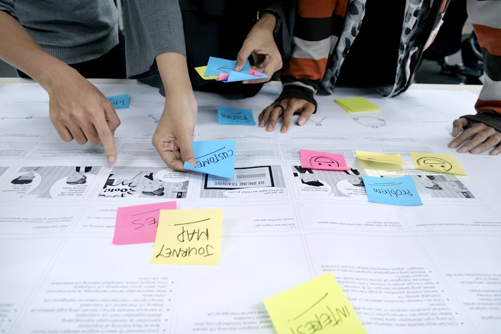
Product Overview: Including Sketches, Wireframes, and Prototypes

The case study effectively utilizes visual representations, such as sketches, wireframes, and prototypes, to demonstrate how the new app seamlessly integrates into users' lives. The prototypes showcase the following:
The prototype showcases the app's ability to provide customized news based on users' preferences.
The prototypes showcase the case study, employing a user journey map to illustrate how the revamped New York Times app fits into users' daily routines. This journey map organizes user actions into a timeline and adds depth by incorporating their thoughts and emotions, creating a compelling narrative.
The final prototype of the app includes two modes: manual mode and automatic mode. This demonstrates the importance of providing users with options and personalization to cater to their individual preferences and time constraints.
Conclusion
This case study highlights the importance of addressing user needs, understanding their habits, and continuously iterating on the design to enhance the user experience and retain user loyalty.
Other related article